Client : Safe and Swasth

Safe & Swasth: Branding

OVERVIEW

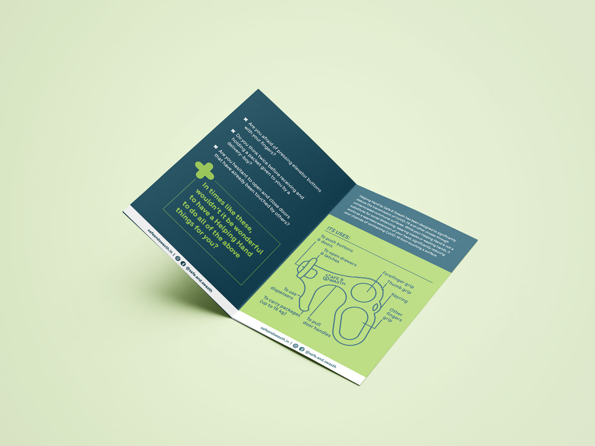
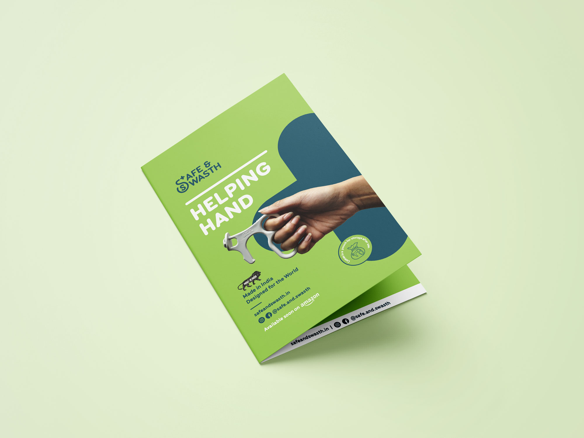
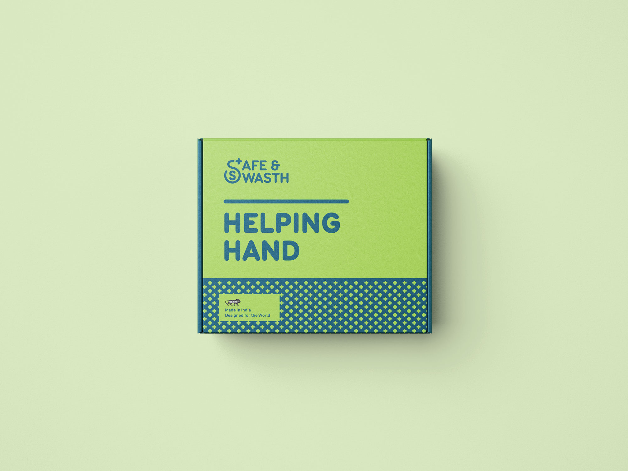
The pandemic called for innovation for many daily tasks to prevent the spread of infection. Safe and Swasth did exactly that with Helping Hand, the contactless safety tool that they needed branding for.

OBJECTIVE

To create a visual language for Helping Hand that conveyed valuable information in a clean, crisp and friendly way.

Simple Visual Communication

Safe and Swasth’s Covid key is a multi-functional tool that was super-handy during a time that was scary for most people. We aimed to convey its utility while allaying fears that potential consumers might have had.

Mood & Tonality

We designed a branding style that was easy to comprehend and remember. The smooth lines and classic colours helped build an identity that was based on a mixture of seriousness, safety and simplicity.

“ It was a pleasure to work with Shubhangi and the Ladyfingers team for developing the brand identity for Safe & Swasth. They have a great aesthetic and were very professional, especially when it came to meeting deadlines. Would definitely recommend! ”

- Vishrut Kanoria, Founder, Safe & Swasth

Viewed best on Portrait mode